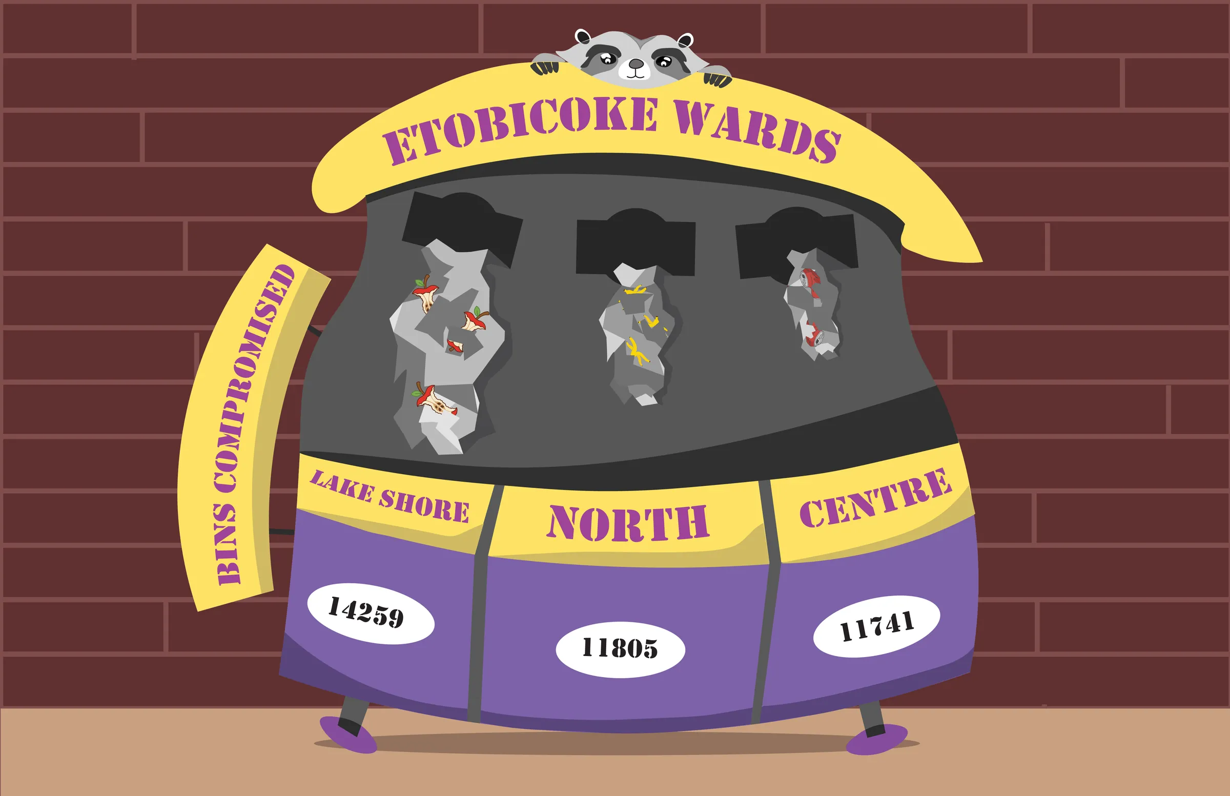
Bins Compromised infographic - a raccoon peeks over a purple and yellow commercial garbage bin against a dark brick wall, with trash spilling from three slots labelled Lake Shore, North and Centre.
Infographic · Data analysis

Bins
Compromised

Role
Analysis, illustration
Dataset
Raccoon Activity Index
Tools
Excel, Illustrator, Firefly
Subset
Etobicoke, three wards

Toronto logs raccoon activity hour by hour, ward by ward. Somewhere in those 54,000 rows sat a question worth drawing: which corner of Etobicoke has the most bins broken into by raccoons?

The numbers

Excel
Excel worksheet of the Raccoon Activity Index with a SUMIF formula in the bar and a summary table of bins compromised for all 25 Toronto wards.
Step 01 - Analysis

Three months, 25 wards

The dataset holds ninety days of hourly logs: units spotted, bins compromised, standoffs with humans, and how long they lasted on average. A summary sheet built on Excel functions pulled bin totals for every ward, alongside max, min and averages, and set complaints against the average weight of a raccoon. Citywide, 335,957 bins were compromised. Etobicoke's three wards became the story.

Lake Shore Highest
14,259
North
11,805
Centre
11,741

Bins compromised by Etobicoke ward, of 335,957 citywide

The Process

Column · Area · Pie
Refined pencil sketch of the chosen concept: a commercial garbage bin titled Etobicoke Wards with a raccoon on top, trash hanging from three slots and ward totals below.
Step 02 - The pick

A column chart, upside down

Eight thumbnails worked through column, area and pie forms: trash spilling from a tipped bin, a garbage truck hauling the totals, a pie drawn into a can's lid. This one won. Each slot in a commercial bin is a ward, the trash hanging out of it is the bar, and the exact totals sit where a number line would. The raccoon on top does the work of a title, and the responsible party never has to be named.

Iteration

Three passes
Black and white vector line work of the bin concept in Illustrator, traced from the pencil sketch.

Pass 01 - Vector mask

The sketch went into Illustrator and came back as clean line work. The trash turned angular, the lettering switched to a stencil with a city feel, and the edges got squared away.

Illustrator work in progress with the purple and yellow colour scheme applied to the bin, banner and ward panels.

Pass 02 - Colour

Purple and yellow bring in the carnival feel. The text moved from black to purple in the same pass, so the type and the panels read as one system instead of two.

Illustrator work in progress with apple cores added to the trash spilling from the bin slots.

Pass 03 - Trash coding

Apple cores went into the spill so the grey shapes read as garbage from across the room.

Drawing the litter

Firefly to vector
Adobe Firefly generations of a flat vector style apple core and banana peel.
Step 03 - Assets

AI drew the trash, not the chart

No design decision came from AI. It supplied the litter: an apple core, a banana peel and a crushed cola can, generated in Firefly as flat vector-style images, then recoloured so they sit inside the spill without breaking the palette.

Adobe Firefly generations of a crushed red cola can in a simple vector style.
Step 04 - Trace

From prompt to path

The prompts asked for simple, unbranded shapes that would survive a trace. Illustrator's Image Trace feature turned each PNG into a usable vector, so the pieces scale cleanly, take the infographic's colours, and read as drawn rather than dropped in.

The finished Bins Compromised infographic in full: raccoon, purple and yellow bin, and the three ward totals against a brick wall.
Back to

Portfolio Showcase